Can Your Social Media Dashboard Predict the Lifecycle of Your Content?
- Sweta Panigrahi
- Aug 14, 2025
- 10 min read

It’s Monday morning, and you are staring at your social media dashboard. The numbers are in: last week’s posts, this week’s trending hashtags, the bump in engagement after that funny meme you repurposed.
You check the charts, make a mental note of what to repeat (and what to avoid), then close the tab until next week. That’s the ritual for most social media managers. Open dashboard, scan numbers, screenshot for a quick Slack update, move on.
But your dashboard is more than a scoreboard. It’s not just telling you what already happened. It’s showing you the life story of your content.
Every post you publish has a pulse. It’s born the moment you hit “share.” It spikes when people first see it. And eventually, it dies.
Some posts burn out fast, like TikToks that rack up 70% of their views in a single day. Others live surprisingly long lives, like Instagram Reels, which can keep climbing for over two months.
The problem is that most managers aren’t looking at their dashboards this way. They see vanity snapshots instead of timelines.
Most of us ask, “How did we do last week?” when the better question is, “How long will this content keep working for us?”
Think about it. If you knew your Facebook photo would keep delivering views for 70 days, you’d give it room to breathe instead of crowding it out with another post tomorrow.
Your dashboard already has the data to tell you these stories. The trick is to stop treating it like a rearview mirror and start treating it like a calendar, a map of where your content is going, not just where it’s been.
And so today, we’ll tell you exactly how to do that.
What our study revealed about content lifecycles?
For this study, we analyzed hundreds of thousands of posts across major platforms. To define a post’s lifespan, we measured how long it takes to reach 95% of its lifetime viewership.
Unlike most analytics platforms that only show cumulative totals, Measure Studio helped us track daily performance and highlight which posts are still generating views.
That armed us with a unique take. We could pinpoint exactly when a post has peaked, and when it’s officially fading.
On looking at the data, one truth stood out! Every post has a natural arc — birth, peak, and decline. But the length of that arc changed dramatically depending on the platform and the format. Here’s a quick snapshot of that:
1. Facebook: Fast peaks, slow fades
Photos

Photos live surprisingly long here, lasting up to 70 days, over 3x longer than Instagram photos. Great for testing content ideas.
Videos
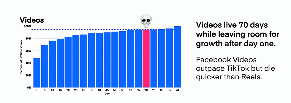
Solid evergreen bet at ~70 days. Big push on day one, but unlike TikTok, they keep pulling views for weeks.
Reels

Slow burn, climbing steadily for 65 days. Not as strong as Instagram, but still worth consistent posting.
Carousels
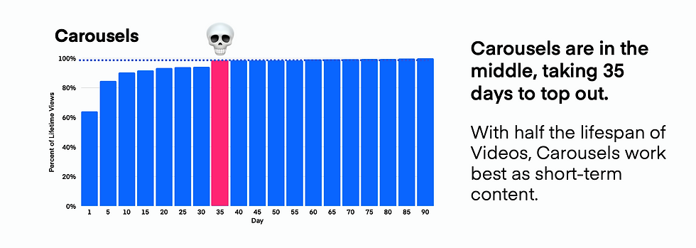
Middle ground at ~35 days. Good for quick, swipeable engagement.
Text Posts

Burn bright and fast. About 10 days of growth before fading. Use to test hooks or messaging.
Links

Dead on arrival. <7 days of life. If you must post, keep the URL in comments.
2. Instagram: Built to last (Sometimes)
Reels

Reigning champ at ~75 days. Biggest long-term reach on the platform where your best ideas should live.
Carousels

Decent shelf life at 35 days. Strong first-day performer (73% of views come early). Use as testing grounds for Reel ideas.
Photos

Fizzle fast, only 20 days on average. Quick hits, great for filling calendar gaps or testing visuals.
3. YouTube: Evergreen giant
Videos

Unmatched longevity of 850+ days. Still pulling views years later. Best format for building a library of timeless, discoverable content.
Shorts

Burn hot, burn fast. Around 35 days of relevance, with 60% of views on day one. Perfect for teasing full videos or repurposing highlights.
4. TikTok: Quick hits, quick death
Videos

Live for about 35 days. 70%+ of engagement hits day one, but momentum can stretch and reach a bit longer.
Carousels

Even shorter shelf life (~20 days). Lower-stakes content: quick tests, experimental ideas, filler when you need to stay consistent.
How to turn your dashboard into a forecasting tool?
Most social media dashboards show you what happened yesterday. That’s useful but if you stop there, you are always playing catch-up.
When we combined our internal lifecycle study with Measure Studio’s dashboards, we realized something bigger! Your dashboard can actually help you predict where content is headed next. Let’s break it down.
1. See lifecycles in action
Most tools only give you totals, impressions, engagement, clicks. Totals flatten the story. A post that racked up 50K views looks the same whether those views happened in one day or spread over two weeks.
Measure Studio updates daily, which means you see the curve of performance. Create a chart widget that tracks daily views or watch time for each post. Watch the curve!
Is it still climbing, plateauing, or already flat? Posts still climbing mean you shouldn’t bury them with new uploads. If they have flatlined, it’s safe to move on.
How to add a metric chart in Measure Studio:

Go to the Dashboard tab in your account.
Click Create New Dashboard or select an existing one.
Choose Add Widget and select Chart.
Pick your platform(s) and accounts you want to analyze.
Search for the metric you want for lifecycles, use Daily Views, Daily Watch Time, or Engagements per Day.
Choose how you want to display it.
Click Save, then drag and resize it wherever you want on the dashboard.
Now, when you open your dashboard, you’ll see the lifecycle curve of each post. If views are still climbing, don’t release new content yet. If the line has leveled off, you know the post’s life is complete and you can safely move on.
2. Custom views for each team
Your organic team cares about shares and engagement trends. Your paid team is focused on CTR. Executives just want a high-level view of growth.
Most social media analytics tools force everyone to look at the same dashboard, which usually means clutter and confusion.
But with Measure Studio, dashboards are fully customizable, so each group can have their own version of the truth without drowning in irrelevant data.
Create one dashboard for organic with charts comparing formats (Reels vs. Carousels).
Build another for paid, with CPC and CTR tracked daily.
Set up a simplified executive dashboard with just top-line KPIs like follower growth or total reach. Share each one with the right team using permissions.
How to create tailored dashboards:

Head to the Dashboard tab in your Measure Studio account.
Select Create New Dashboard. Give it a clear name like Organic Team View or Executive Overview.
Start building widgets:
For organic teams: Add charts comparing performance of different content types (e.g., Reels vs. Carousels) and widgets for shares, saves, and engagement rate.
For paid teams: Add data tables and charts for CTR, CPC, and CPM, refreshed daily. You can even set up separate dashboards per campaign.
For executives: Keep it high-level. Add just the key metrics — follower growth, total reach, and impressions. A couple of clean charts are enough.
Use drag-and-drop to arrange widgets in the most logical flow for each team.
Click Share at the top of the dashboard.
Give access only to the relevant team members.
Use permissions so execs can view but not edit, and paid teams don’t see organic dashboards (and vice versa).
With this setup, every team logs into Measure Studio and immediately sees the data that matters to them. You can also click on Dashboard and head to the Manage Dashboard page to set a particular dashboard as your default.
3. Put lifecycle tracking on autopilot
When you are managing hundreds of posts across multiple platforms, just staying organized can feel like a full-time job. That’s where Post Groups come in.
Instead of manually tagging and tracking every piece of content, you set rules once and Measure Studio automatically updates the group every day.
Want to see how all TikToks from your Summer Sale campaign are performing? Just set the rule, and every new TikTok with that tag will be added to the group automatically.
How to create Post Groups:
In your Measure Studio account, go to the Post Groups tab.
Click Create New Group and name it (e.g., Instagram – Summer Sale).
Set your rules:
Example: Platform = Instagram, Tag = Summer Sale.
You can mix filters like campaign tags, content format (Reel, Carousel, Video), or even date ranges.
Hit Save, and your Post Group will automatically pull in all relevant posts.
Add the group as a widget on your dashboard (chart or table).
Charts let you see whether performance is still climbing or flattening.
Tables give you an instant comparison across campaigns or formats.
Now, instead of manually chasing down campaign posts, you have a self-updating view that tells you exactly when content is peaking and when it’s time to move on.
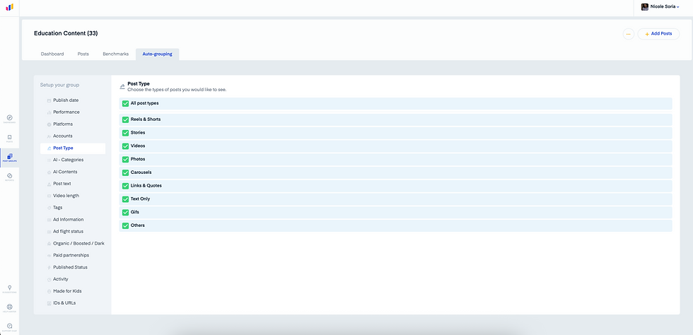
Want to edit already existing groups? Head to Post Group and click on the one you need to edit. Go to Auto-grouping to set your preferences.
4. Don’t cut off growth too soon
One of the easiest mistakes in social media management? Posting new content while older content is still climbing. On long-tail platforms like YouTube Shorts or TikTok, this can kill momentum by cutting off the algorithm’s push too early.
On short-tail platforms like Facebook, the performance flatlines within 24–48 hours, so you can move on quickly without worrying about overlap.
How to track growth before posting again:
Open your dashboard and click Add Widget → Chart.
Choose your platform (TikTok, YouTube, Facebook, etc.) and account(s).
Select the metric Daily Views (or Daily Watch Time for video).
Display as a line graph for easy trend spotting.
Add this chart to your dashboard and pin recent posts.
Now, before scheduling new uploads, check the curve:
📈 Still climbing? Hold off — let the algorithm keep pushing.
➖ Plateaued or dropping? Safe to post again.
This quick check helps you avoid stepping on your own success and maximizes the natural lifecycle of each post.
5. Benchmark to see if your recent post is really winning
It’s easy to look at a post with 10K views and think it’s a win. But is it? Without context, numbers don’t tell you much. That’s where benchmarking comes in.
By comparing your recent posts to your historical averages, you can instantly see if something is outperforming, underperforming, or right on track.
How to set up benchmarking in your dashboard:

In your dashboard, click on Recent content.
Set platform and account.
All posts will automatically label performance:
Green(Doing great) - Post is outperforming.
No color(About Average) - Post is tracking normally.
Red(Could Do Better) - Needs improvement.
This gives you a quick, color-coded snapshot of how your latest content is really doing. Use it to celebrate wins, spot underperformers early, and double down on formats that consistently beat the benchmark.
6. Keep a close watch on your KPI metric
Not all metrics tell the same story. A post might get average views but stellar engagement, or weak CTR but great watch time.
With the Benchmarking tab, you can zoom in on a specific metric and see exactly how it stacks up against your historical norm.
How to use benchmarking for metrics:

Go to the Benchmarking tab in your dashboard.
Pick the metric you want to evaluate (views, watch time, engagement rate, CTR, etc.).
Filter by account or post type if you want more precision.
Compare recent performance to your median benchmark.
This lets you spot strengths and weaknesses at the metric level. Maybe your photos aren’t driving clicks but they are crushing engagement, now you know exactly where to adjust your strategy.
7. Check audience insights by account
Sometimes it’s not the content, it’s the audience. The Audience tab shows you detailed breakdowns for each account, so you can see who you are reaching and how they behave.
How to use the audience insights:

Open the Audience tab in Measure Studio.
Select the account you want to analyze.
Explore audience data like demographics or top countries.
Layer these insights with your post performance.
If your TikTok is outperforming in a new country, test localized content.
If engagement skews higher with certain age groups, adjust creative style or posting times.
By connecting audience data with performance benchmarks, you get the full picture: not just how a post did, but why it resonated (or didn’t).
Wrapping up
Every post has a beginning, middle, and end. The difference between a manager who just “posts and prays” and one who drives sustained growth is the ability to see those stages clearly and act on them.
Your dashboard already contains the data you need, but most platforms bury it in totals and vanity metrics.
By layering lifecycle tracking, benchmarking, and audience insights, you stop guessing and start forecasting. You’ll know which posts deserve room to breathe, which ones are falling short of expectations, and which audiences are quietly fueling your wins.
That’s not just reporting, that’s strategy.
With Measure Studio, you can put this into practice today. Build dashboards that reveal curves instead of snapshots. Compare every new post against historical benchmarks.
Then, tie performance back to the real people behind the numbers. And most importantly, predict the natural arc of your content so you never waste momentum again.
Because when you can see the future of your content, you can finally control it.
Frequently Asked Questions
How do I know when a post has officially "died"?
A post is considered past its lifecycle when daily performance (views, watch time, or engagement) flattens or drops consistently. In Measure Studio, you can track this with a Daily Views chart. If the curve has plateaued for several days, it’s safe to move on.
Why should I care about benchmarks instead of just raw numbers?
Raw numbers can be misleading. A post with 10K views might look impressive, but if your median performance is 50K, it’s actually underperforming. Benchmarks give you context, helping you see whether a post is truly above average, average, or below expectations.
What's the biggest mistake social media managers make with content lifecycles ?
The most common mistake is posting too soon while older content is still climbing. This can cut off growth prematurely, especially on long-tail platforms like YouTube Shorts or TikTok. Using lifecycle charts in your dashboard ensures you give high-performing posts the breathing room they need.


The observation about TikTok posts burning out fast, with 70% of views in a single day, really redefines how we should schedule content. That kind of insight makes an ai song extender feel like a necessary tool to keep short-lived material circulating longer.
The point about treating your dashboard like a calendar instead of a rearview mirror really resonates; I've seen how easy it is to just glance at past numbers and miss the content's actual lifespan. Understanding whether a post has a short or long lifecycle helps decide when to repurpose or refresh it. For video-heavy strategies, using something like subtitlestool to batch create subtitles for evergreen YouTube content can extend its reach further.
A social media dashboard? That's where all the digital magic (and data) happens! If you're sifting through analytics and want to make sure your insights look as sharp as they are, this Color Palette Generator could help you find that perfect visual touch.
SaveMeFree offers fun quiz pages and amusing results for casual browsing. The overall experience feels straightforward.
DigiBouquet is a creative bouquet site that feels both sweet and modern. The design keeps things approachable.